
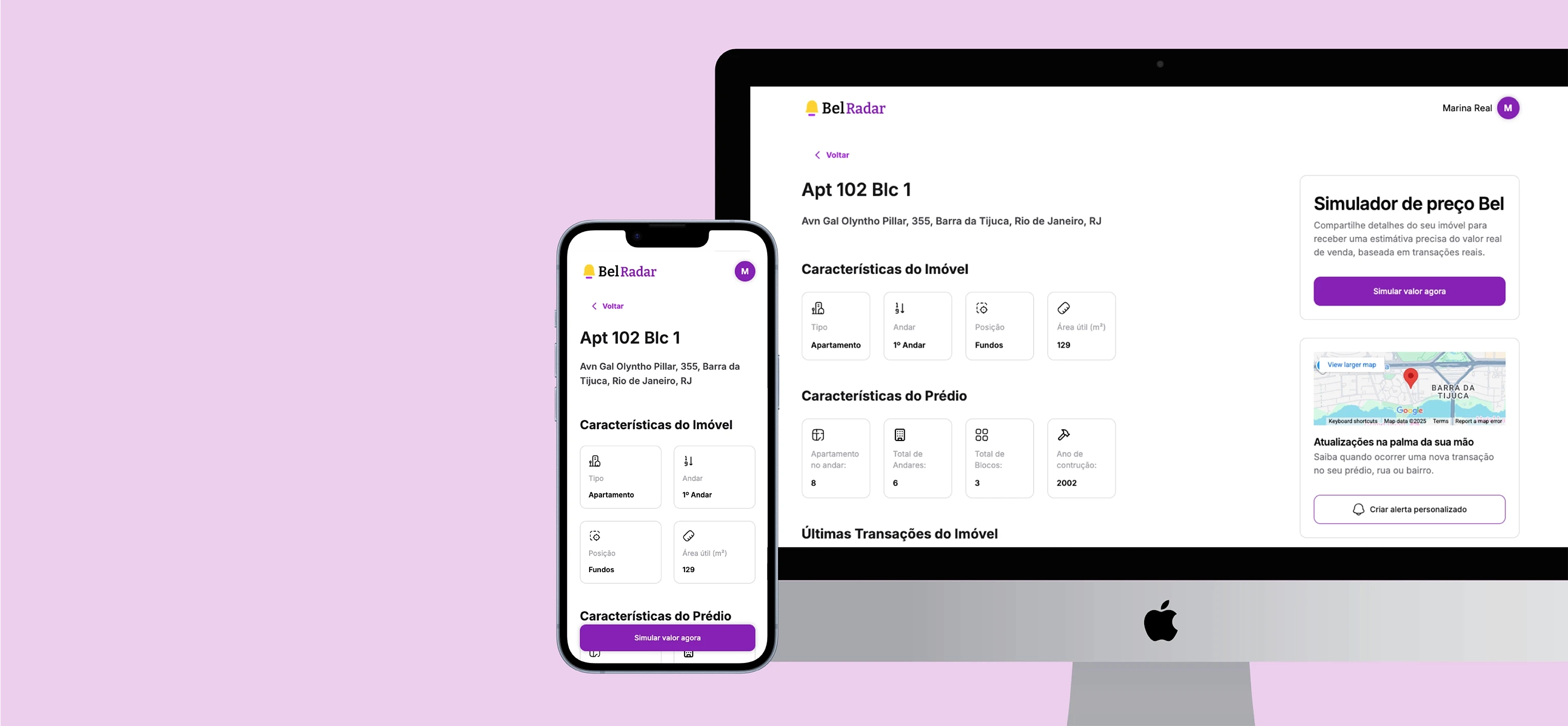
Discovery drives an increase from 60% to 83% in real estate page views.
The brief said “improve the interface.” The real problem was identity.
I was hired to improve the experience of Bel Radar v0, a pricing tool based on real estate transaction data. On the surface, it looked like an interface project: reorganizing screens, refining flows, and making it more visually appealing.
But I don’t redesign what I don’t understand. And when I opened the product, it became clear we had a much bigger problem than layout: no one on the team really knew what that product actually was.
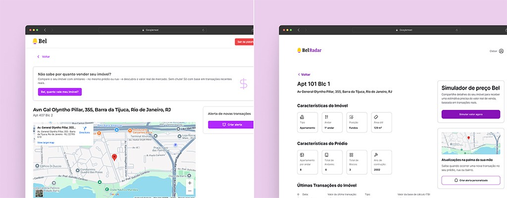
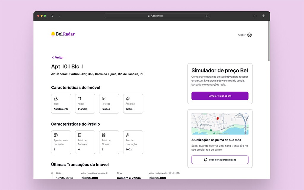
F1: Property Page V0
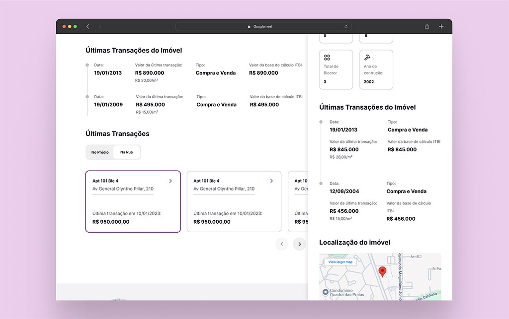
F2: Property Page after UX/UI improvements
Three areas, three different products in mind
Marketing saw one thing. Product saw another. Technology had its own interpretation. Bel Radar v0 existed without focus—an undefined audience, unclear purpose, confusing flows, and a cluttered interface with no hierarchy.
Users would enter, explore—but not understand the value or what to do next. And the product didn’t convert.
I could have gone straight to Figma. But designing screens without aligning on vision is just masking the problem. Any redesign would have been superficial.
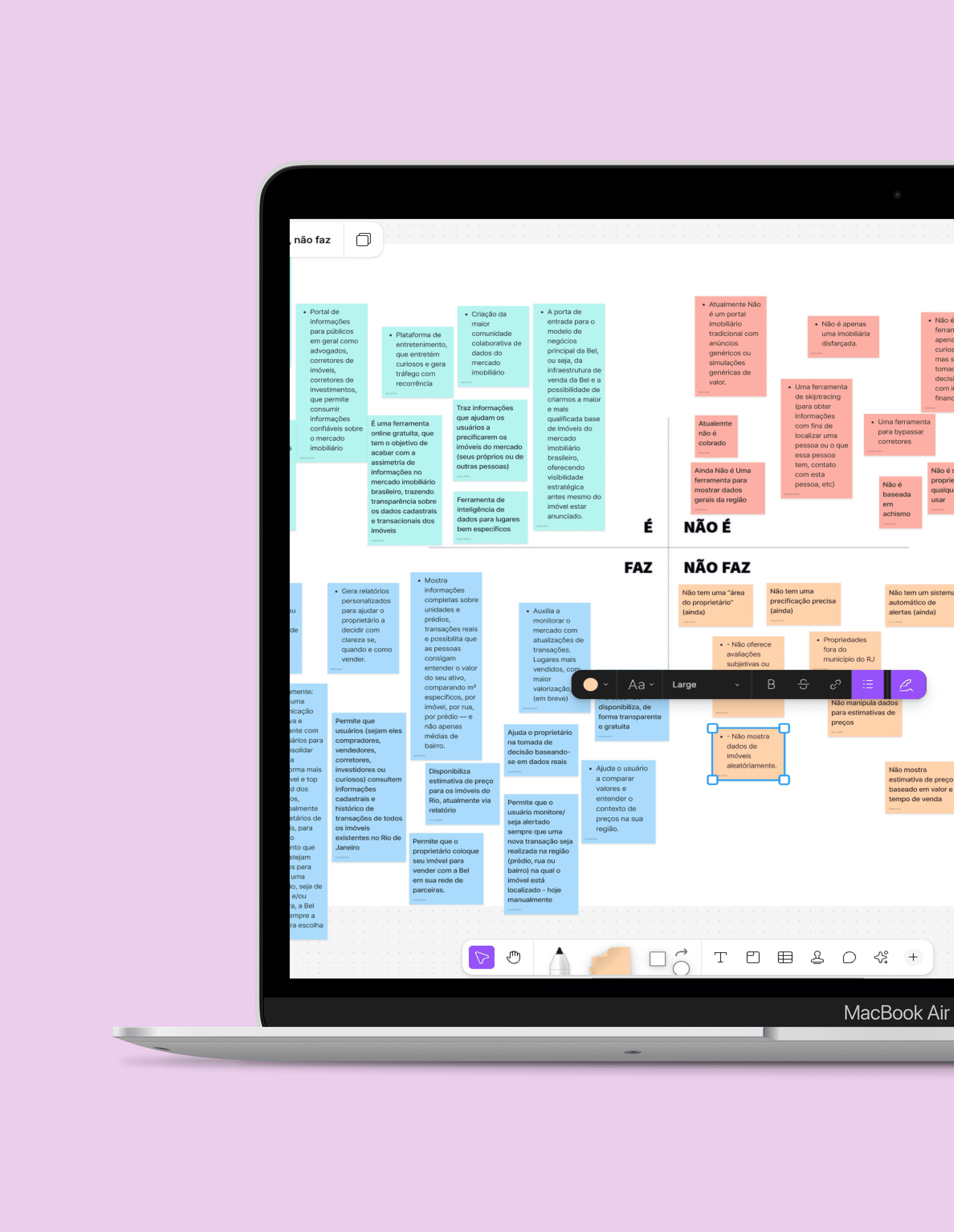
I stopped everything. First, we needed to figure out what we were actually building.
I led an alignment workshop with the entire team: “Is / Is not / Does / Does not.” It sounds simple. It isn’t. Because when each person has a different version of the product in their head, you’re not building a product—you’re building Frankenstein.
The exercise led to a definition that changed the direction of the project:
"Bel Radar is a real estate intelligence tool driven by real data, designed to reduce information asymmetry in the market and support more informed decision-making."
Reducing information asymmetry. That clicked for me. Because when information is uneven, the ones who lose are always the more vulnerable side of the negotiation—the homeowner who doesn’t know what their property is worth, the buyer negotiating in the dark.
Now we had a clear direction. And it pointed to something much bigger than a beautiful interface.
I looked outward and realized: we had gold in our hands.
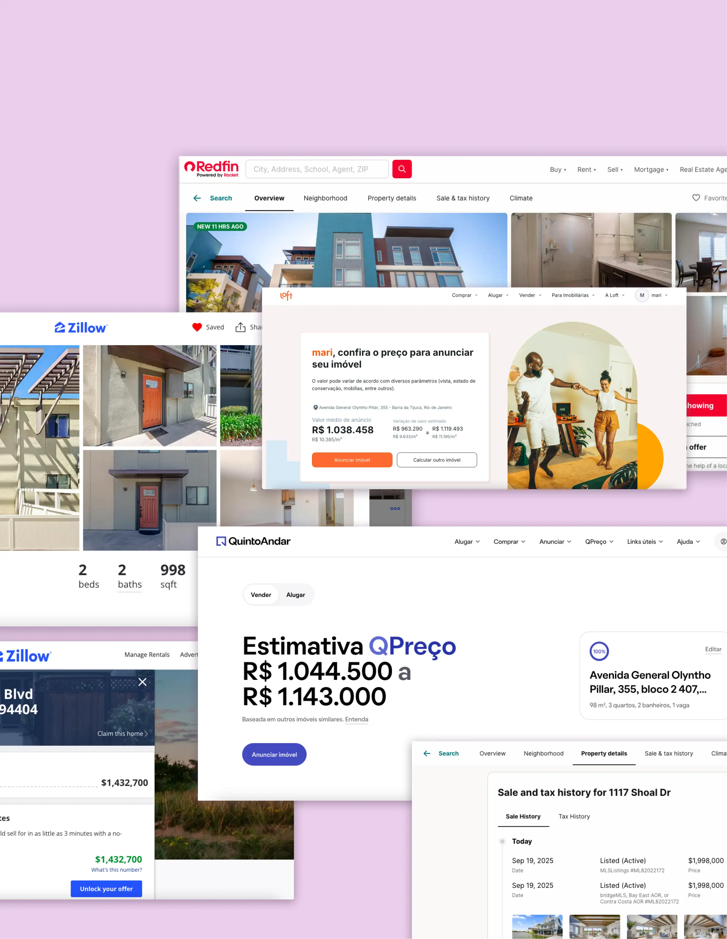
I analyzed the flows, interfaces, and features of major competitors, both nationally and internationally.
And then it clicked.
In the United States, real estate transaction history is public. Anyone can see how much a property was sold for and when. Total transparency.
In Brazil? Nothing. You search for an apartment and only see the listing price—which is what the seller wants, not what the property is actually worth. Any estimate you get is based on that distortion.
Our differentiator wasn’t price estimation. It was giving access to real data that no one else had—registry records, property tax data, transfer taxes—concrete information that levels the playing field between buyers and sellers.
We were treating gold as if it were just another calculator.
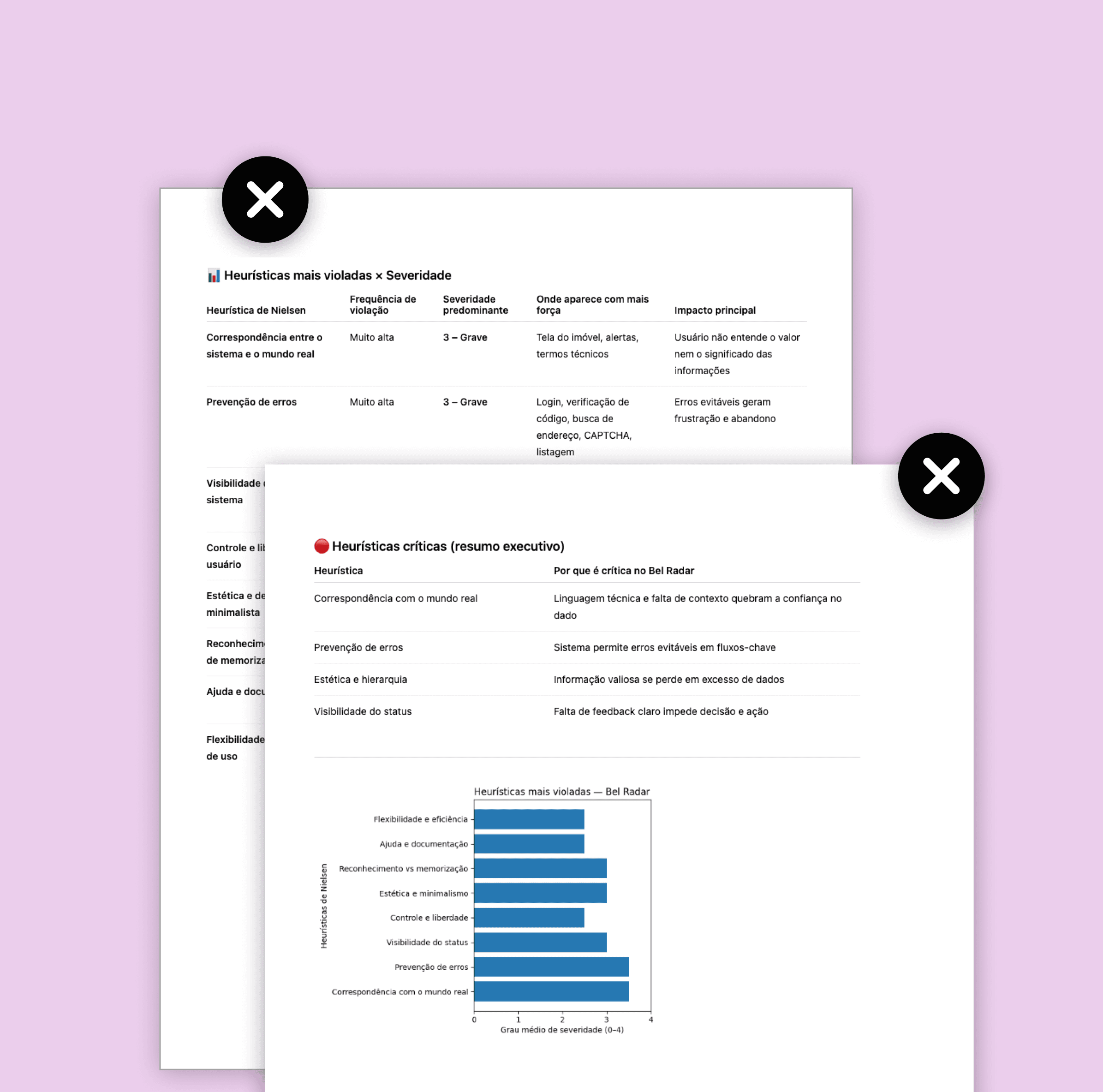
The heuristic evaluation confirmed what my instinct had already been telling me.
I conducted a systematic heuristic evaluation of v0. The problems were glaring:
Match with the real world
Severity
4
Error prevention
Severity
3
Aesthetics and information hierarchy
Severity
4
Visibility of system status
Severity
4
But I know fixing usability doesn’t solve the underlying problem. We still hadn’t validated whether we were delivering what people actually needed. Optimizing the usability of something that maybe shouldn’t even exist in that form? That doesn’t make sense.
My decision was straightforward: qualitative interviews + usability testing together. Find the truth before designing a single pixel.
The moment everything shifted
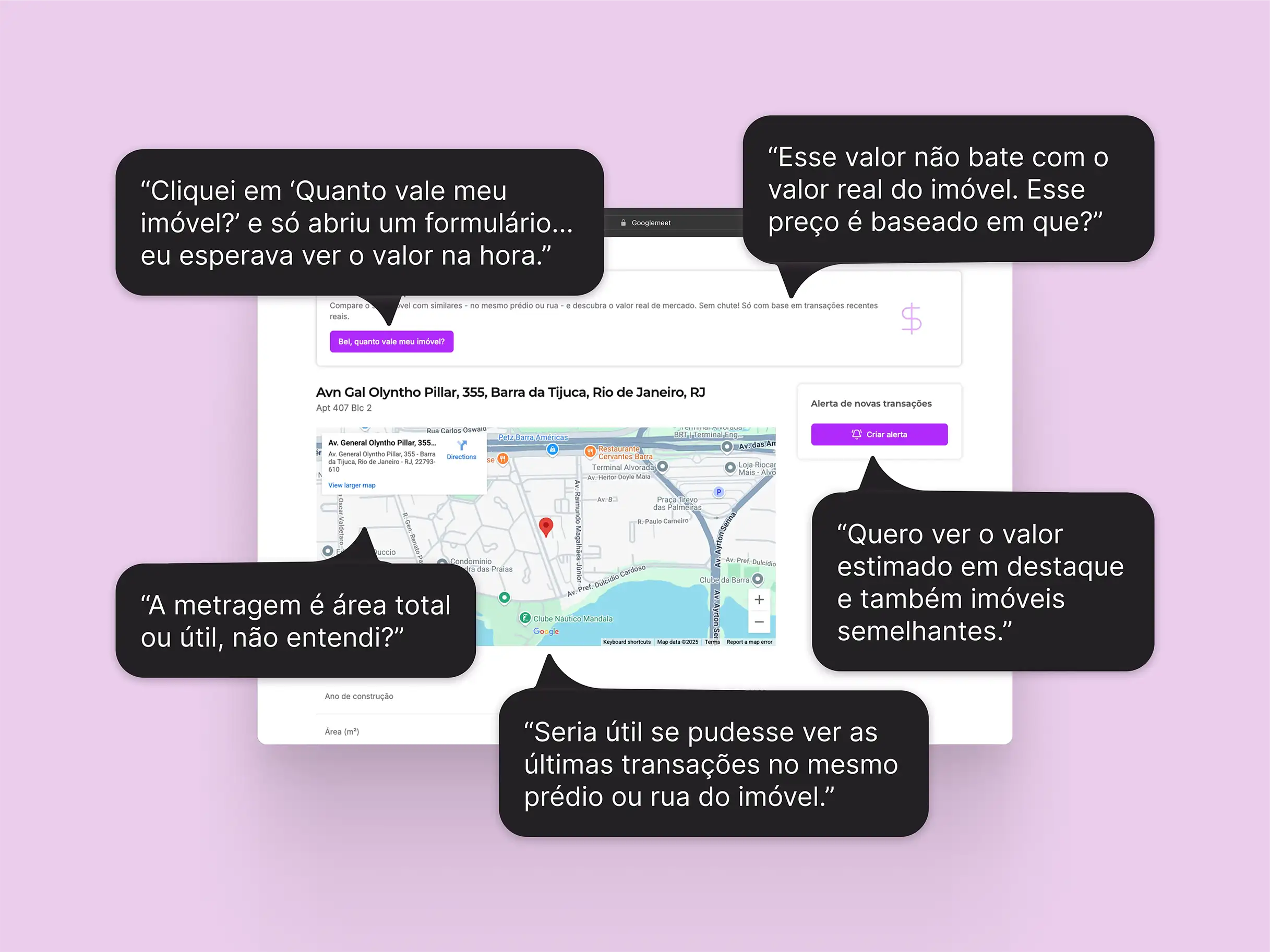
I spoke with homeowners looking to sell and with investors—house flippers who buy, renovate, and resell properties. And it was in one of those conversations that it fully clicked.
They didn’t want an estimate. They wanted context. They wanted transparency.
The price simulation—the main highlight of v0—wasn’t the most valuable part. What really mattered was access to real data to make informed decisions: pricing context within the building, the street, and the neighborhood. Position, floor level, usable area. Transaction history.
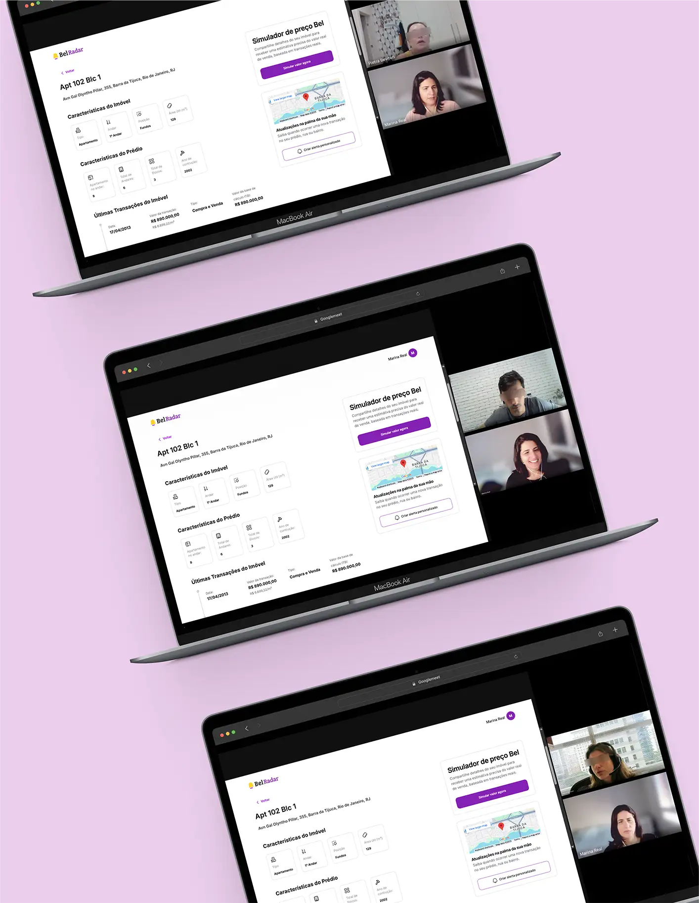
During the interviews, one investor said:
“More than an estimate, I need real benchmarks. Knowing how much apartments in the same building were sold for gives me confidence to set and negotiate the price.”
Confidence. Real benchmarks. Fair negotiation. This isn’t a feature—it’s the reduction of information inequality. And that was exactly what we could deliver.

Prioritizing without ego, with method
I brought the findings to a session with stakeholders, engineering, and data. No guesswork—we evaluated impact, effort, urgency, and business value, item by item. The decision was unanimous:
Reposition transaction history as the product’s core value proposition.
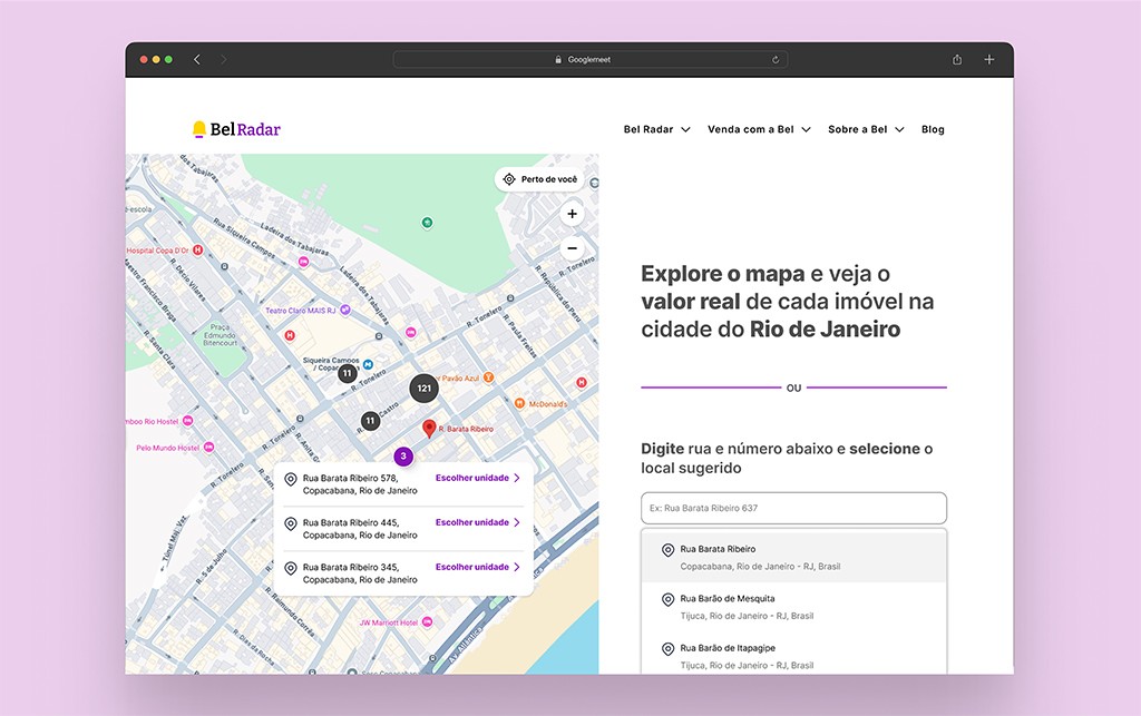
And that changed the scope. It wasn’t just about redesigning the property page. I redesigned the entire flow—from entering the address to completing the property details—and every interaction that leads the user there.
Redesign with purpose, validated by users
The new concept was built on four clear decisions:
Transaction history front and center — date, price, type of deal. The most valuable data in the product, finally in the place it deserved.
Other properties in the building and on the street — because context is what turns raw data into decision-making intelligence.
Visual hierarchy that naturally guides the eye — no noise, no overload. Every element in the right place, in the right order.
Price simulation as a strategic CTA — no longer the main focus, but the logical next step once the user understands the context.
I defined style guidelines based on Bel’s visual identity. Redesigned the interface in high fidelity. Prototyped it. And ran another round of testing. The concept was validated. Fine-tuned—and then we moved into implementation.
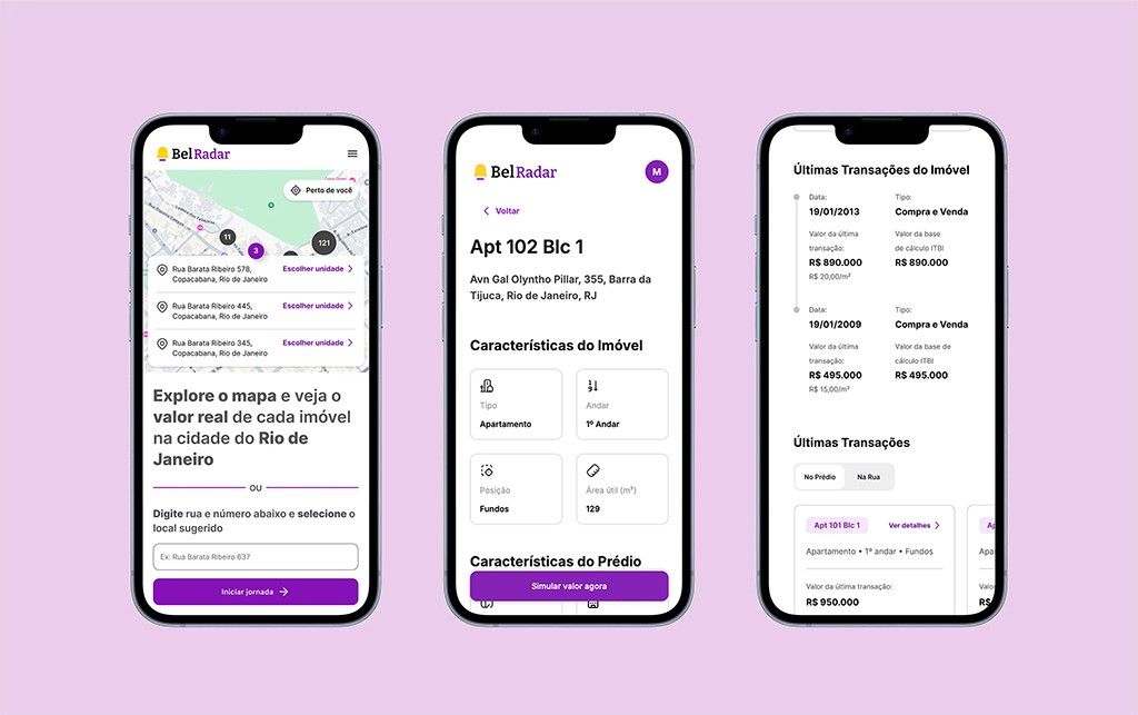
High-fidelity screens of the mobile flow
The outcome: from a generic calculator to intelligence powered by transparency
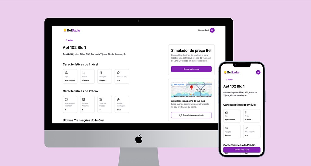
The property page stopped being a generic price simulator and became what it should have always been: a real estate intelligence tool grounded in data transparency.
Property page views: from 60% to 83%.
A direct impact.
What started as a redesign became an ecosystem
This discovery uncovered an opportunity no one had seen before. From these insights, three new tools emerged—bringing transparency to the entire real estate market:
Bel is no longer “just another pricing tool.” It’s becoming a reference in real estate intelligence in Brazil.
Bel Radar Pro
A transactional data dashboard with metrics by neighborhood, street, and address for brokers and agencies.
Bel Matrícula
Property title issuance using only the address, with official registry data.
Bel Alerta
Real-time alerts for new listings and price changes across major platforms.
What this project taught me
Discovery prevents waste.
Without understanding the problem, you only get faster at building the wrong thing.
Data only matters when it changes decisions.
Having information isn’t enough. Context is what turns data into decision-making power—and when that power is distributed fairly, everyone benefits.
Value propositions come from users, not meeting rooms.
Price simulation was the company’s hypothesis. Data transparency was the real value for the people using the product.
Because design doesn’t exist just to sell. It exists to reduce inequalities.
Discover the true value of real estate transactions

Next Case